1 Programming with ggplot2
To make your code more flexible, you need to reduce duplicated code by writing functions.
1.1 Single components
Each component of a ggplot plot is an object. you can save any component to a variable or wrap them in a function and then add it to plots.
bestfit <- geom_smooth(
  method = "lm",
  se = FALSE,
  colour = alpha("steelblue", 0.5),
  size = 2
)

geom_lm <- function(formula = y ~ x, colour = alpha("steelblue", 0.5),
                    size = 2, ...)  {
  geom_smooth(formula = formula, se = FALSE,
              method = "lm", colour = colour, size = size, ...)}
# variable
ggplot(mpg, aes(cty, hwy)) +
  geom_point() +
  bestfit |
# function
ggplot(mpg, aes(displ, 1 / hwy)) +
  geom_point() +
  geom_lm(y ~ poly(x, 2), size = 1, colour = "red")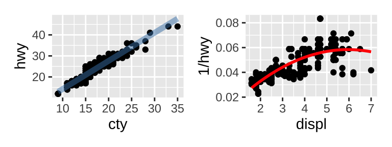
When included in the function definition “...” allows a function to accept arbitrary additional arguments. Inside the function, you can then use “...” to pass those arguments on to another function.
1.2 Multiple components
ggplot2 has a convenient way of adding multiple components to a plot in one step with a list.
geom_mean <- function(se = TRUE) {
  list(
    stat_summary(fun = "mean", geom = "bar", fill = "grey70"),
    if (se)
    # confidence limits based on t-distribution
    stat_summary(fun.data = "mean_cl_normal", geom = "errorbar", width = 0.4)
    )}
ggplot(mpg, aes(class, cty)) + geom_mean()|
ggplot(mpg, aes(drv, cty)) + geom_mean(se = FALSE)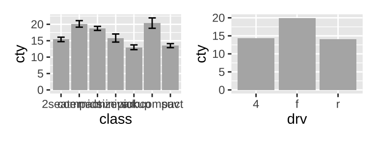
You can also include any of the following object types in the list:
- A data.frame (If you add a data frame by itself, you’ll need to use
%+%, but this is not necessary if the data frame is in a list.) - An
aes()object, which will be combined with the existing default aesthetic mapping. - Scales, with a warning if they’ve already been set by the user.
- Coordinate systems and faceting specification.
- Theme components.
It’s often useful to add standard annotations (e.g.borders()) to a plot. There are two other options that you should set, which ensure that the layer is self-contained:
inherit.aes = FALSEprevents the layer from inheriting aesthetics from the parent plot. This ensures your annotation works regardless of what else is on the plot.show.legend = FALSEensures that your annotation won’t appear in the legend.
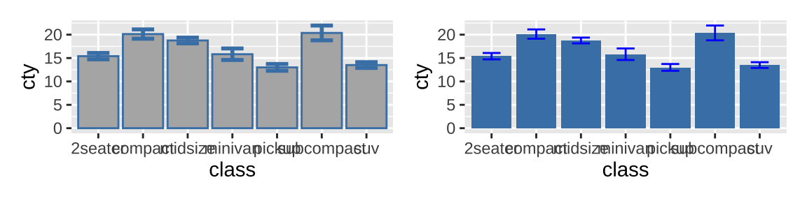
If you want to pass additional arguments to the components in your function, ... is no good: there’s no way to direct different arguments to different components. To get you started, here’s one approach using modifyList() and do.call():
geom_mean <- function(..., bar.params = list(), errorbar.params = list()) {
  params <- list(...)
  bar.params <- modifyList(params, bar.params)
  errorbar.params  <- modifyList(params, errorbar.params)

  bar <- do.call("stat_summary", modifyList(
    list(fun = "mean", geom = "bar", fill = "grey70"),
    bar.params)
  )
  errorbar <- do.call("stat_summary", modifyList(
    list(fun.data = "mean_cl_normal", geom = "errorbar", width = 0.4),
    errorbar.params)
  )
# add components to a list
  list(bar, errorbar)
}

ggplot(mpg, aes(class, cty)) +
  geom_mean(
    colour = "steelblue",
    errorbar.params = list(width = 0.5, size = 1)
  )|
ggplot(mpg, aes(class, cty)) +
  geom_mean(
    bar.params = list(fill = "steelblue"),
    errorbar.params = list(colour = "blue")
  )
1.3 Plot functions
Instead of creating components, you might want to write a function that takes data and parameters and returns a complete plot. You can take a similar approach to drawing parallel coordinates plots (PCPs).
piechart <- function(data, mapping) {
  ggplot(data, mapping) +
    geom_bar(width = 1) +
    coord_polar(theta = "y") +
    xlab(NULL) +
    ylab(NULL)
}
# pcp
pcp_data <- function(df) {
  is_numeric <- vapply(df, is.numeric, logical(1))

  # Rescale numeric columns
  rescale01 <- function(x) {
    rng <- range(x, na.rm = TRUE)
    (x - rng[1]) / (rng[2] - rng[1])
  }
  df[is_numeric] <- lapply(df[is_numeric], rescale01)
  # Add row identifier
  df$.row <- rownames(df)
  # Treat numerics as value (aka measure) variables
  # gather_ is the standard-evaluation version of gather, and
  # is usually easier to program with.
  tidyr::gather_(df, "variable", "value", names(df)[is_numeric])
}
pcp <- function(df, ...) {
  df <- pcp_data(df)
  ggplot(df, aes(variable, value, group = .row)) + geom_line(...)
}
piechart(mpg, aes(factor(1), fill = class))|
pcp(mpg, aes(colour = drv))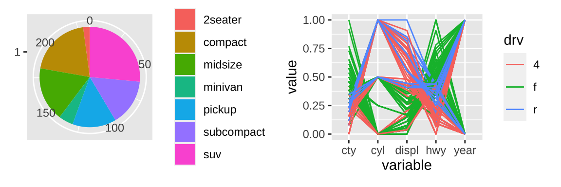
There’s no way to store the name of a variable in an object and then refer to it in aes(), but aes_() gives us three options for how a user can supply variables:
- as a string (Using a quoted call, created by
quote(),substitute(),as.name(), orparse()) - as a formula (created with
~). - as a bare expression.
piechart1 <- function(data, var, ...) {
  piechart(data, aes_(~factor(1), fill = as.name(var)))
}
piechart2 <- function(data, var, ...) {
  piechart(data, aes_(~factor(1), fill = var))
}
piechart3 <- function(data, var, ...) {
  piechart(data, aes_(~factor(1), fill = substitute(var)))
}
piechart1(mpg, "class") + theme(legend.position = "none")|
piechart2(mpg, ~class) + theme(legend.position = "none")|
piechart3(mpg, class) + theme(legend.position = "none")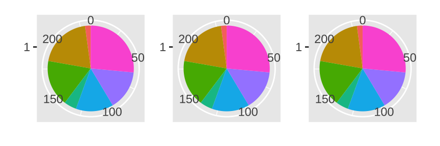
1.4 Functional programming
Since ggplot2 objects are just regular R objects, you can put them in a list. This means you can apply all of R’s great functional programming tools.
geoms <- list(
  geom_point(),
  geom_boxplot(aes(group = cut_width(displ, 1))),
  list(geom_point(), geom_smooth())
)

p <- ggplot(mpg, aes(displ, hwy))
wrap_plots(lapply(geoms, function(g) p + g),ncol = 3)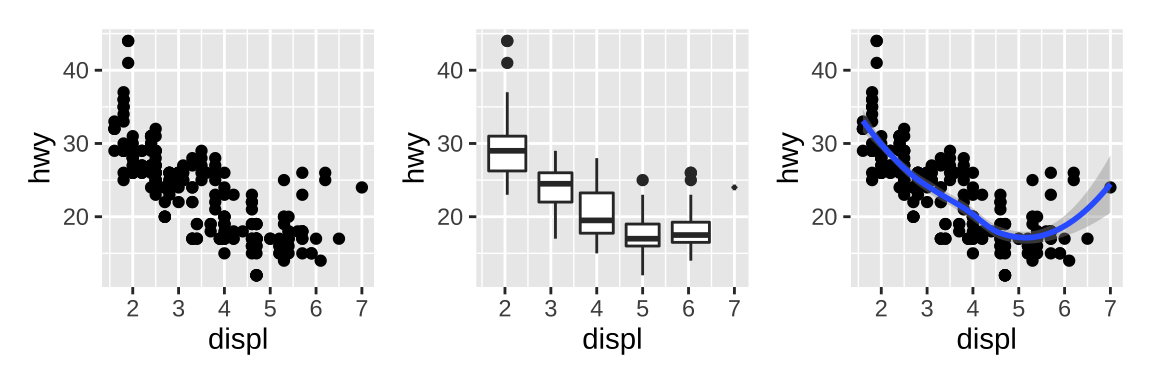
2 ggplot2 internals
2.1 The plot() method
The code in our simplified print method reveals four distinct steps:
- First, it calls
ggplot_build()where the data for each layer is prepared and organized into a standardized format suitable for plotting. - Second, the prepared data is passed to the
ggplot_build()and turns it into it into graphic elements stored in a gtable (we’ll come back to what that is later). - Third, the gtable object is converted to an image with the assistance of the grid package.
- Fourth, the original ggplot object is invisibly returned to the user.
p <- ggplot(mpg, aes(displ, hwy, color = drv)) +
  geom_point(position = "jitter") +
  geom_smooth(method = "lm", formula = y ~ x) +
  facet_wrap(vars(year)) +
  ggtitle("A plot for expository purposes")
# simple ggprint as an
ggprint <- function(x) {
  data <- ggplot_build(x)
  gtable <- ggplot_gtable(data)
  grid::grid.newpage()
  grid::grid.draw(gtable)
  return(invisible(x))
}

ggprint(p)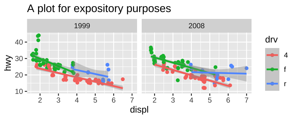
2.2 The build step
2.2.1 Data preparation
A layer can either provide data in one of three ways:
- supply its own (e.g., if the data argument to a geom is a data frame),
- inherit the global data supplied to
ggplot(), - provide a function that returns a data frame when applied to the global data
In all three cases the result is a data frame that is passed to the plot layout. During this process the data associated with each layer will be augmented with a PANEL column.
2.2.2 Data transformation
It is at this stage of the process that any argument to trans in a scale has an effect, and all subsequent rendering will take place in this transformed space.
The second step in the process is to map the position aesthetics using the position scales, which unfolds differently depending on the kind of scale involved.
At the third stage in this transformation the data is handed to the layer stat where any statistical transformation takes place. Notice that this is why stat() expressions – including the formula used to specify the regression model in the geom_smooth() layer – cannot refer to the original data (must use y~x etc.). It simply doesn’t exist at this point.
The last part of the data transformation is to train and map all non-positional aesthetics, i.e. convert whatever discrete or continuous input that is mapped to graphical parameters such as colors, linetypes, sizes etc. At the very last step, both the stat and the facet gets a last chance to modify the data in its final mapped form with their finish_data() methods before the build step is done.
2.2.3 Output
The return value of ggplot_build() is a list structure with the ggplot_built class. It contains the computed data, as well as a Layout object holding information about the trained coordinate system and faceting. Further it holds a copy of the original plot object, but now with trained scales.
2.3 The gtable step
The purpose of ggplot_gtable() is to take the output of the build step and turn it into a single gtable object that can be plotted using grid. At this point the main elements responsible for further computations are the geoms, the coordinate system, the facet, and the theme. The stats and position adjustments have all played their part already.
The first thing that happens is that the data is converted into its graphical representation.
- each layer is converted into a list of graphical objects (
grobs). - the geom does some additional transformation of the data.
The output is the basis of the final gtable object. Then, legends will be rendered and added to the main gtable object, while another type of guide-axes has already been assembled.
The only thing remaining is to add title, subtitle, caption, and tag as well as add background and margins, at which point the final gtable is done.
2.4 Introducing ggproto
ggproto is a custom build class system made specifically for ggplot2 to facilitate portable extension classes. A ggproto object is created using the ggproto() function, which takes a class name, a parent class and a range of fields and methods:
Person <- ggproto("Person", NULL,
  first = "",
  last = "",
  birthdate = NA,

  full_name = function(self) {
    paste(self$first, self$last)
  },
  age = function(self) {
    days_old <- Sys.Date() - self$birthdate
    floor(as.integer(days_old) / 365.25)
  },
  description = function(self) {
    paste(self$full_name(), "is", self$age(), "old")
  }
)
# New instances of the class is constructed
# by subclassing the object
Me <- ggproto(NULL, Person,
  first = "Thomas Lin",
  last = "Pedersen",
  birthdate = as.Date("1985/10/12")
)

Me$description()
#> [1] "Thomas Lin Pedersen is 35 old"
3 Writing ggplot2 extensions
ggplot2 has been designed in a way that makes it relatively easy to extend the functionality with new types of the common grammar components. There’s a complete example-Case study: springs.
3.1 New themes
Themes are probably the easiest form of extensions as they only require you to write code you would normally write when creating plots with ggplot2. It is usually easier and less error-prone to modify an existing theme. Certain parts of the theme can be replaced using the exported %+replace% operator.
3.2 New stats
The main logic of a stat is encapsulated in a tiered succession of calls: compute_layer(), compute_panel(), and compute_group().
The default behavior of compute_layer() is to split the data by the PANEL column, call compute_panel(), and reassemble the results. Likewise, the default behavior of compute_panel() is to split the panel data by the group column, call compute_group(), and reassemble the results.
Thus, it is only necessary to define compute_group(), i.e. how a single group should be transformed, in order to have a working stat. Outside of the compute_*() functions, the remaining logic is found in the setup_params() and setup_data() functions.
3.3 New geoms
The main functionality of geoms is, like for stats, a tiered succession of calls: draw_layer(), draw_panel(), and draw_group(), and it follows much the same logic as for stats.
3.4 New coords
The only place where you might call any methods from a coord is in a geoms draw_*() method where the transform() method is called on the data to turn the position data into the right format before creating grobs from it. coord_sf() supports all the various projections needed in cartography.
3.5 New scales
The simplest is the case where you would like to provide a convenient wrapper for a new palette to an existing scale. For this case it will be sufficient to provide a new scale constructor that passes the relevant palette into the relevant basic scale constructor e.g. the viridis scale:
print(scale_fill_viridis_c)
#> function (..., alpha = 1, begin = 0, end = 1, direction = 1,
#>     option = "D", values = NULL, space = "Lab", na.value = "grey50",
#>     guide = "colourbar", aesthetics = "fill")
#> {
#>     continuous_scale(aesthetics, "viridis_c", gradient_n_pal(viridis_pal(alpha,
#>         begin, end, direction, option)(6), values, space), na.value = na.value,
#>         guide = guide, ...)
#> }
#> <bytecode: 0x7f9c12fbbd28>
#> <environment: namespace:ggplot2>
Another relatively simple case is where you provide a geom that takes a new type of aesthetic (e.g. line width) that needs to be scaled.
A last possibility is creating a new primary scale type besides continuous, discrete, and binned scales.
3.6 New positions
Positions recieves the data just before it is passed along to drawing, and can alter it in any way it likes, though there is an implicit agreement that only position aesthetics are affected by position adjustments. The Position class is slightly simpler than the other ggproto classes as it has a very narrow scope.
3.7 New facets
Facets are responsible for recieving all the different panels, attching axes (and strips) to them, and arranging them in the expected manner. All of this requires a lot of gtable manipulation and grid understanding and can be a daunting undertaking.