1 Introduction
The scales toolbox divide scales into three main groups:
- Position scales and axes.
- Color scales and legends.
- Scales for other aesthetics.
2 Position scales and axes
Sometimes an aesthetic is mapped to a computed variable that does not need to be explicitly specified, as happens with geom_histogram(), which use the computed variable count.
2.1 Numeric
The most common continuous position scales are the default scale_x_continuous() and scale_y_continuous(). Other functions like scale_x_log10(), scale_x_reverse() transform the data, which can also be achieved by setting the trans option.
| Name | Function | Name | Function |
|---|---|---|---|
| asn | \(\tanh^{-1}(x)\) | logit | \(\log(\frac{x}{1 - x})\) |
| exp | \(e ^ x\) | pow10 | \(10^x\) |
| identity | \(x\) | probit | \(\Phi(x)\) |
| log | \(\log(x)\) | reciprocal | \(x^{-1}\) |
| log10 | \(\log_{10}(x)\) | reverse | \(-x\) |
| log2 | \(\log_2(x)\) | sqrt | \(x^{1/2}\) |
Specifically, if you use a transformed scale, the axes will be labeled in the original data space; if you transform the data, the axes will be labeled in the transformed space. To transform after statistical computation use coord_trans().
# manual transformation
ggplot(mpg, aes(log10(displ), hwy)) +
  geom_point() |

# transform using scales
ggplot(mpg, aes(displ, hwy)) +
  geom_point() +
  scale_x_log10()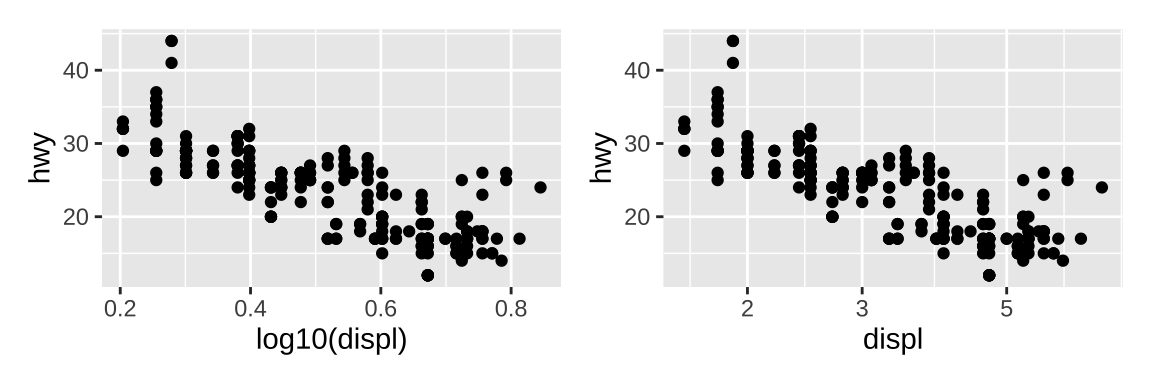
By default, ggplot2 converts data outside the scale limits to NA, because the default value of oob (out of boundary) argument is scales::censor(). Setting it to scales::squish() will squishes all values into the range.
The space around the plot can be eliminated with expand = c(0, 0). To make sure some values are shown on the plots, use expand_limits().
ggplot(faithfuld, aes(waiting, eruptions)) +
  geom_raster(aes(fill = density)) +
  theme(legend.position = "none") +
  expand_limits(x=1,y=1)|

ggplot(faithfuld, aes(waiting, eruptions)) +
  geom_raster(aes(fill = density)) +
  scale_x_continuous(expand = c(0,0),
                     trans = "reverse") +
  scale_y_continuous(expand = c(0,0)) +
  theme(legend.position = "none")|

ggplot(faithfuld, aes(waiting, eruptions)) +
  geom_raster(aes(fill = density)) +
  # multiply 5
  scale_x_continuous(expand = c(5,0)) +
  # add 5 at each side
  scale_y_continuous(expand = c(0,5)) +
  theme(legend.position = "none")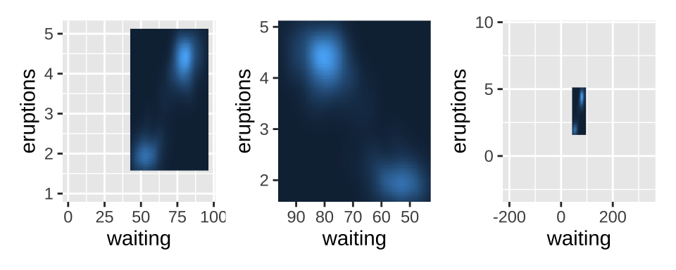
Breaks can be added manually, but ggplot2 also allows you to pass a function to breaks:
scales::breaks_extended()creates automatic breaks for numeric axes (the standard method).scales::breaks_log()creates breaks appropriate for log axes.scales::breaks_pretty()creates “pretty” breaks for date/times.scales::breaks_width()creates equally spaced
Every break is associated with a label and these can be changed by setting the labels argument to the scale function:
scales::label_bytes()formats numbers as kilobytes, megabytes etc.scales::label_comma()formats numbers as decimals with commas added.scales::label_dollar()formats numbers as currency.scales::label_ordinal()formats numbers in rank order: 1st, 2nd, 3rd etc.scales::label_percent()formats numbers as percentages.scales::label_pvalue()formats numbers as p-values: <.05, <.01, .34, etc.
As with breaks, you can also supply a function to minor_breaks, such as scales::minor_breaks_n() or scales::minor_breaks_width() functions that can be helpful in controlling the minor breaks. However, these minor breaks do not add ticks on the axis.
toy <- data.frame(
  const = 1,   up = 1:4,  txt = letters[1:4],
  big = (1:4)*1000,  log = c(2, 5, 10, 2000))
# add breaks without labels
brks = seq(500, 4000, 250)
lbs <- ifelse(brks%%1000 == 0, brks, "")
# plot
axs <- ggplot(toy, aes(big, const)) +
  geom_point() +
  labs(x = NULL, y = NULL)
# minor breaks
axs +
  scale_x_continuous(breaks = scales::breaks_extended(n = 4),
                         minor_breaks = seq(1500,4000,250))|
# use offset to control breaks
axs +
  scale_x_continuous(breaks = scales::breaks_width(800, offset = 200))|
# control labels
axs +
  scale_y_continuous(labels = scales::label_dollar(prefix = "¥",
                                                   suffix = "€"))|
# breaks without labels
axs +
  scale_x_continuous(breaks = brks, labels = lbs)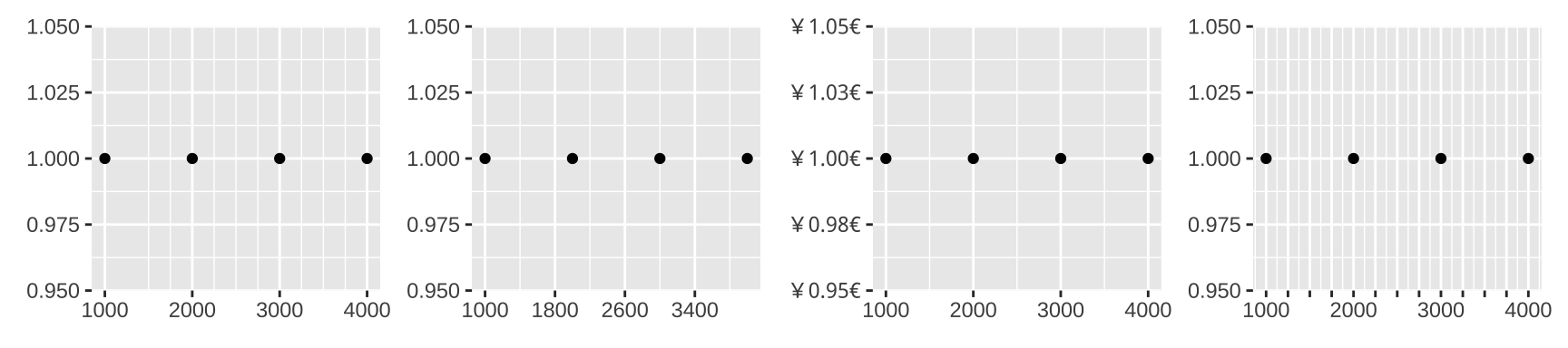
2.2 Date-time
Different formats of date/time can be converted by a few functions (as.Date(), as.POSIXct() or hms::as_hms()) or the lubridate package. Default scale for dates is scale_x_date() and scale_x_datetime() is default for data-time data.
Breaks and minor breaks can be specified by date_breaks and data_minor_breaks respectively. Date label formatting is useful when there’s no sufficient room.
date_base <- ggplot(economics, aes(date, psavert)) +
  geom_line(na.rm = TRUE) +
  labs(x = NULL, y = NULL)

date_base + scale_x_date(date_breaks = "25 years",
                         date_minor_breaks = "5 years",
                         date_labels = "%y") |
# formatting with function label_date, or label_date_short
date_base + scale_x_date(labels = scales::label_date("%Y"))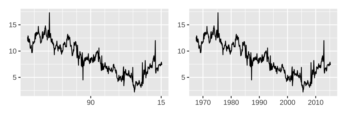
2.3 Discrete
The default scales mapping discrete variables to position scales are scale_x_discrete() and scale_y_discrete(). Internally, ggplot2 handles discrete scales by mapping each category to an integer value and then drawing the geom at the corresponding coordinate location. Labels of the discrete variable can be set by labels and guide_axis() controls their layout.
base <- ggplot(mpg, aes(manufacturer, hwy)) + geom_boxplot()

base + guides(x = guide_axis(n.dodge = 3)) |
# as.character() is not needed for numbers
base + scale_x_discrete(labels = 1:length(unique(mpg$manufacturer)))+
       guides(x = guide_axis(angle = 90))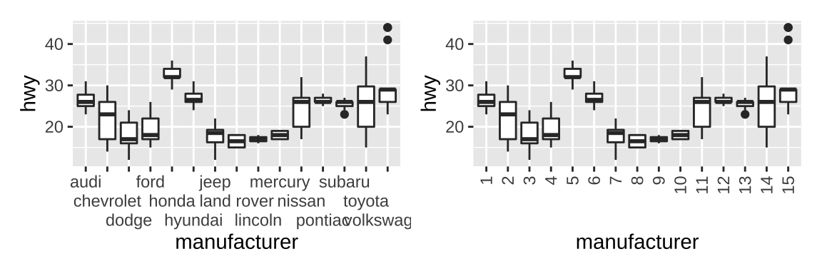
2.4 Binned
Continuous variables can be sliced into multiple bins (e.g. geom_count).
base <- ggplot(mpg, aes(hwy, class)) +
  geom_count()

base |
base + scale_x_binned(n.breaks = 10)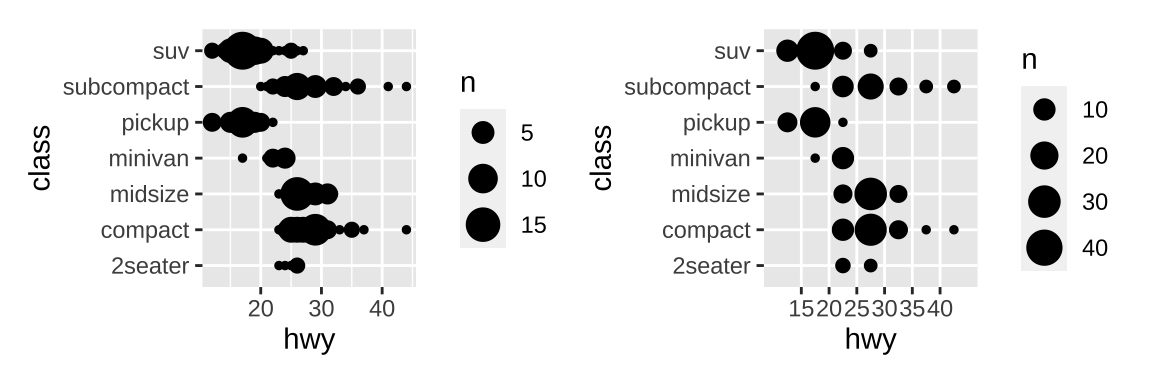
2.5 Limits
To make sure different plots share the same axes and legend, just like faceted plots, multiple limits (x, y, color, etc.) should be set.
mpg_99 <- mpg %>% filter(year == 1999)
mpg_08 <- mpg %>% filter(year == 2008)

base_99 <- ggplot(mpg_99, aes(displ, hwy, color = fl)) +
  geom_point()
base_08 <- ggplot(mpg_08, aes(displ, hwy, color = fl)) +
  geom_point()

base_99 +
  scale_x_continuous(limits = c(1, 7)) +
  scale_y_continuous(limits = c(10, 45)) +
  scale_color_discrete(limits = c("c", "d", "e", "p", "r"))|
base_08 +
  # lims() is another option
  lims(x = c(1, 7), y = c(10, 45),
       color = c("c", "d", "e", "p", "r"))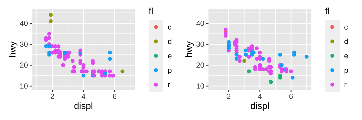
3 Color scales and legends
3.1 Continuous color scales
There are multiple ways to specify continuous color scales. There are many palettes available, but the common interface is paletteer package.
erupt <- ggplot(faithfuld, aes(waiting, eruptions, fill = density)) +
  geom_raster() +
  scale_x_continuous(NULL, expand = c(0, 0)) +
  scale_y_continuous(NULL, expand = c(0, 0)) +
  theme(legend.position = "none",
        axis.text = element_blank(),
        axis.ticks = element_blank(),
        axis.line=element_blank(),)

plots <- list(erupt,
              erupt + scale_fill_viridis_c(option = "magma"),
              erupt + scale_fill_distiller(palette = "RdPu"),
              erupt + scico::scale_fill_scico(palette = "lajolla"),
              erupt + scale_fill_fermenter(),
              erupt + paletteer::scale_fill_paletteer_c("viridis::plasma"))
wrap_plots(plots,ncol = 3)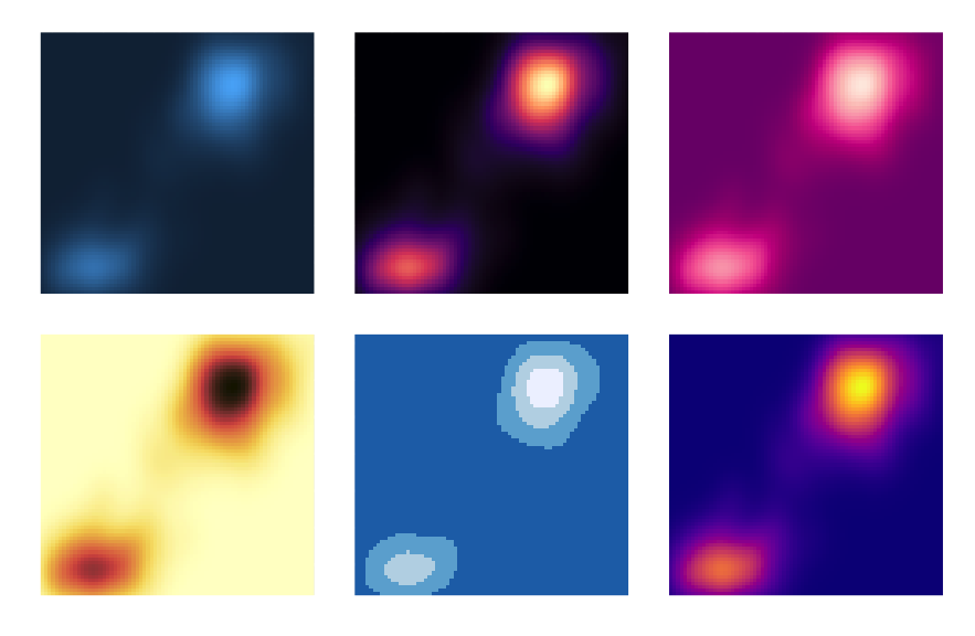
The default scale for continuous fill scales is scale_fill_continuous() which in turn defaults to scale_fill_gradient(). Gradient scales provide a robust method for creating any color scheme you like:
scale_fill_gradient()produces a two-color gradientscale_fill_gradient2()produces a three-color gradient with specified midpointscale_fill_gradientn()produces an n-color gradient
Other packages, such as munsell and colorspace also provide color palettes.
# munsell example
erupt + scale_fill_gradient(
  low = munsell::mnsl("5P 2/12"),
  high = munsell::mnsl("5P 7/12")
) |
# colorspace examples
erupt +
  scale_fill_gradientn(colors = colorspace::heat_hcl(7))|
erupt +
  scale_fill_gradientn(colors = colorspace::diverge_hcl(7))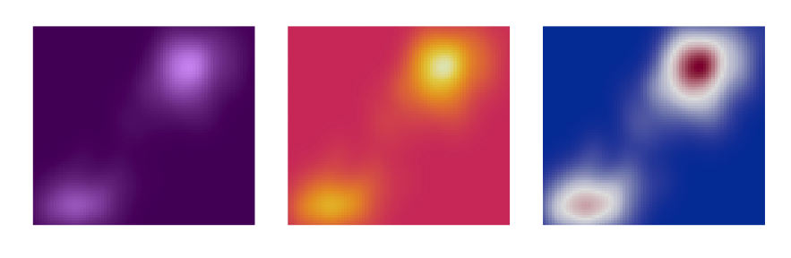
Missing values are set to grey by default, which can be changed by set na.value option. Breaks can be entirely suppressed by setting them to NULL.
df <- data.frame(x = 1, y = 1:5, z = c(1, 3, 2, NA, 5))
base <- ggplot(df, aes(x, y)) +
  geom_tile(aes(fill = z), size = 5) +
  labs(x = NULL, y = NULL)

base |
base + scale_fill_gradient(na.value = NA)|
base + scale_fill_gradient(na.value = "yellow",
                           breaks = NULL)+
        scale_x_continuous(breaks = NULL)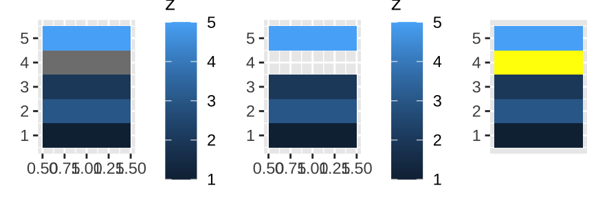
3.2 Discrete color scales
The default scale for discrete colors is scale_fill_discrete() which in turn defaults to scale_fill_hue(), and scale_color_brewer() is a discrete color scale that—along with the continuous analog scale_color_distiller() and binned analog scale_color_fermenter() using handpicked “ColorBrewer” colors.
The default color scheme picks evenly spaced hues around the HCL color wheel. However, it becomes hard to tell the different colors apart when the number of colors exceed eight. Chroma, luminance, and the range of hues, can be controlled with the h, c and l arguments in scale_fill_hue.
df <- data.frame(x = c("a", "b", "c", "d"),
                 y = c(3, 4, 1, 2))
bars <- ggplot(df, aes(x, y, fill = x)) +
  geom_bar(stat = "identity") +
  labs(x = NULL, y = NULL) +
  theme(legend.position = "none")

# Chroma ranging from 0 (grey) to a maximum
# that varies depending on combination of hue and luminance.
bars + scale_fill_hue(c = 40)|
# Hue ranges from 0 to 360 (an angle)
bars + scale_fill_hue(h = c(180, 300))|
# luminance ranging from 0 (black) to 100 (white)
bars + scale_fill_hue(l = 90)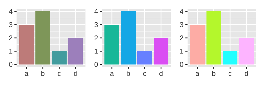
It is better to use scale_fill_grey(), which maps discrete data to grays, from light to dark, to print graphics in black and white.
You can also use scale_fill_manual() to set the colors manually.
Color scales also come in binned versions. The default scale is scale_fill_binned() which in turn defaults to scale_fill_steps(). scale_fill_steps() is analogous to scale_fill_gradient(), and allows you to construct your own two-color gradients.
erupt + scale_fill_steps(low = "grey", high = "brown")|
erupt + scale_fill_steps2(low = "grey", mid = "white",
                          high = "brown", midpoint = .02)|
erupt + scale_fill_stepsn(n.breaks = 12,
                          colors = terrain.colors(12))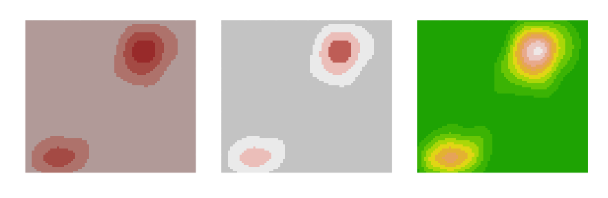
A brewer analog for binned scales is called scale_fill_fermenter(), which does not interpolate between the brewer colors if you set n.breaks larger than the number of colors in the palette.
3.3 Alpha scales
Alpha scales map the transparency of a shade to a value in the data. They are not often useful, but can be a convenient way to visually down-weight less important observations. scale_alpha() is an alias for scale_alpha_continuous().
3.4 Legends
A number of settings that affect the overall display of the legends are controlled through the theme system.
legend.position: The position and justification of legends ( “right”, “left”, “top”, “bottom”, “none”, or a numeric vector of length two).legend.direction: layout of items in legends (“horizontal” or “vertical”).legend.box: arrangement of multiple legends (“horizontal” or “vertical”).legend.box.just: justification of each legend within the overall bounding box, when there are multiple legends (“top”, “bottom”, “left”, or “right”).legend.margin = unit(0, "mm"): suppressing margin around the legends.
base <- ggplot(toy, aes(up, up)) +
  geom_point(aes(color = txt), size = 3)

base + theme(legend.position = c(0, 1),
             legend.justification = c(0, 1))|
base + theme(legend.position = c(0.5, 0.2),
             legend.justification = c(1, 0))|
base + theme(legend.position = c(1, 0),
             legend.justification = c(1, 0))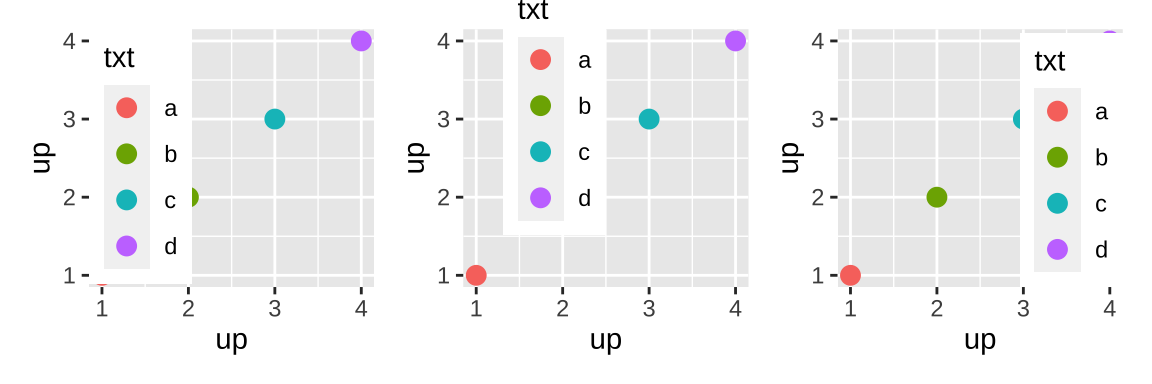
The key_glyph argument can be used to associate a particular layer with a different kind of glyph. More precisely, each geom is associated with a function such as draw_key_path(), draw_key_boxplot(), which can be used to pass desired keys to key_glyph.
base <- ggplot(economics, aes(date, psavert,
                              color = "savings"))+
  theme(legend.position = "bottom")

base + geom_line()|
base + geom_line(key_glyph = "timeseries")|
base + geom_line(key_glyph = draw_key_boxplot) 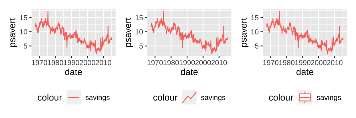
The legend guide displays individual keys in a table. The most useful options are:
nroworncolwhich specify the dimensions of the table.byrowcontrols how the table is filled:FALSEfills it by column (the default),TRUEfills it by row.reversereverses the order of the keys.override.aesis useful when you want the elements in the legend display differently to the geoms in the plot.keywidthandkeyheight(along withdefault.unit) allow you to specify the size of the keys. These are grid units, e.g.unit(1, "cm").
base <- ggplot(mpg, aes(displ, hwy, color = drv)) +
  geom_point(size = 4, alpha = .2, stroke = 0)

base + guides(color = guide_legend()) |
base + guides(color = guide_legend(override.aes = list(alpha = 1)))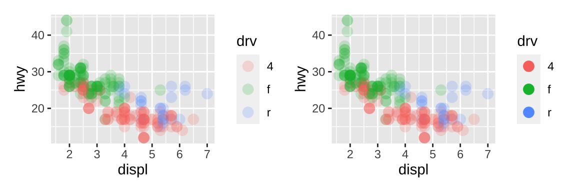
guide_bins() is suited to the situation when a continuous variable is binned and then mapped to an aesthetic that produces a legend, such as size, color and fill.
axisindicates whether the axis should be drawn (default isTRUE).directionis a character string specifying the direction of the guide.show.limitsspecifies whether tick marks are shown at the ends of the guide axis.axis.color,axis.linewidthandaxis.arroware used to control the guide axis that is displayed alongside the legend keys.keywidth,keyheight,reverseandoverride.aeshave the same behavior asguide_legend().
base <- ggplot(mpg, aes(displ, manufacturer, size = hwy)) +
  geom_point(alpha = .2) +
  scale_size_binned()

base + guides(size = guide_bins(show.limits = TRUE,
                                axis = FALSE))|
base + guides(size = guide_bins(axis.colour = "red",# must be colour
              axis.arrow = arrow(length = unit(.1, "inches"),
                                 ends = "first",
                                 type = "closed")))
The color bar guide guide_colorbar() is designed for continuous ranges of colors, which outputs a rectangle where the color gradient varies. The most important arguments are:
barwidthandbarheightcontrol the size of the bar, e.g.unit(1, "cm").nbincontrols the number of slices (default value is 20).reverseflips the color bar.
The guide_colorsteps() guide is a version of guide_colorbar() appropriate for binned color and fill scales. Arguments mostly mirror those for guide_colorbar(). The additional arguments are as follows:
show.limitsindicates whether values should be shown at the ends of the stepped color bar.ticksis a logical variable indicating whether tick marks should be displayed (default isNULL: inherit from the scale).even.stepsis a logical variable indicating whether bins should be evenly spaced (default isTRUE) or proportional in size to their frequency in the data.
base <- ggplot(mpg, aes(displ, hwy, color = cyl)) +
      geom_point() +
      scale_color_binned()
base2 <- ggplot(mpg, aes(cyl, displ, color = hwy)) +
  geom_point(size = 2)

base +
  guides(color = guide_colorsteps(show.limits = TRUE,
                                  ticks = TRUE)) |
base2 +
  guides(color = guide_colorbar(barheight = unit(2, "cm"),
                                ticks = FALSE))|
base2 +
  guides(color = guide_colorbar(barwidth = unit(0.5, "cm"),
                                nbin = 5))
4 Other aesthetics
4.1 Size
The default scale for size aesthetics is scale_size() in which a linear increase in the variable is mapped onto a linear increase in the area. By default the values in the data (more precisely in the scale limits) is mapped to sizes of 1 to 6, which can be changed by range option. To map values to radius, scale_radius() should be used.
planets <- data.frame(
  name = c("Mercury", "Venus", "Earth", "Mars",
           "Jupiter", "Saturn", "Uranus", "Neptune"),
  type = c(rep("Inner", 4), rep("Outer", 4)),
  position = 1:8,
  radius = c(2440, 6052, 6378, 3390, 71400, 60330, 25559, 24764),
  orbit = c(57900000, 108200000, 149600000, 227900000,
            778300000, 1427000000, 2871000000, 4497100000))
planets$name <- with(planets, factor(name, name))
# plot
base <- ggplot(planets, aes(1, name, size = radius)) +
  geom_point() +
  scale_x_continuous(breaks = NULL) +
  labs(x = NULL, y = NULL, size = NULL)

base +
  # default
  scale_size(range = c(1, 6))+
  ggtitle("not to scale")|
base +
  scale_radius(limits = c(0, NA), range = c(0, 10)) +
  ggtitle("to scale")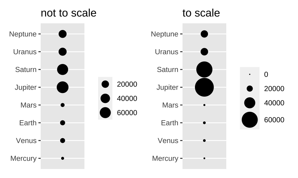
4.2 Shape
To merge different aesthetics to one legend, just set the same name.
ggplot(mpg, aes(displ, hwy)) +
  geom_point(aes(color = drv, shape = drv)) +
  scale_color_discrete("Drive train")+
  scale_shape_discrete("Drive train")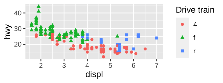
4.3 Line type
# define line types
df_lines <- data.frame(
  linetype = factor(
    1:4,
    labels = c("solid", "longdash", "dashed", "dotted")))
# map variable to linetype
base <- ggplot(economics_long, aes(date, value01))
base + geom_line(aes(group = variable)) |
base + geom_line(aes(linetype = variable))|
# See scale_manual for more flexibility
ggplot(df_lines) +
  geom_hline(aes(linetype = linetype, yintercept = 0),
             size = 2) +
  scale_linetype_identity() +
  facet_grid(linetype ~ .) +
  theme_void(20)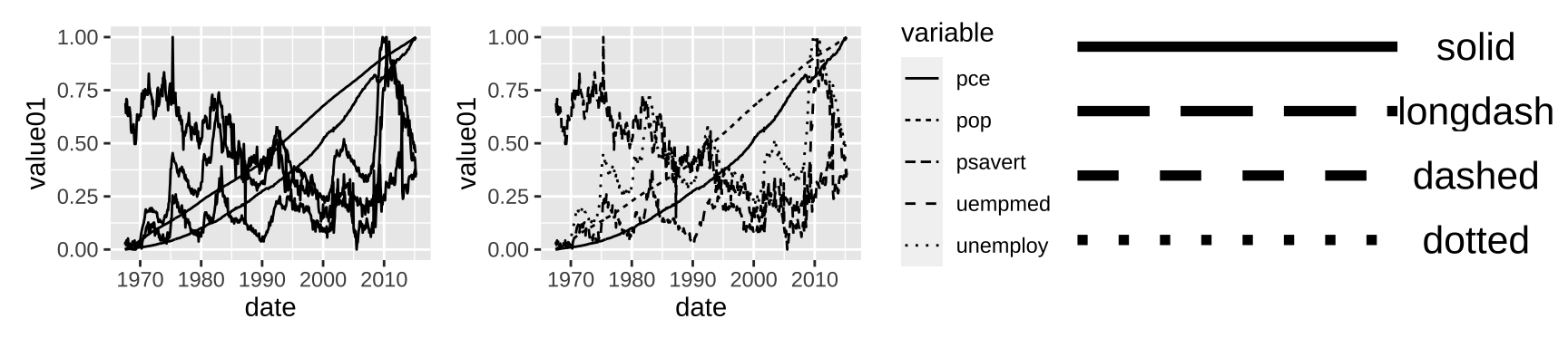
4.4 Manual scales
You can create new scale with the “manual” version of each: scale_linetype_manual(), scale_shape_manual(), scale_color_manual(), etc. Valid aesthetic values are described in vignette("ggplot2-specs").
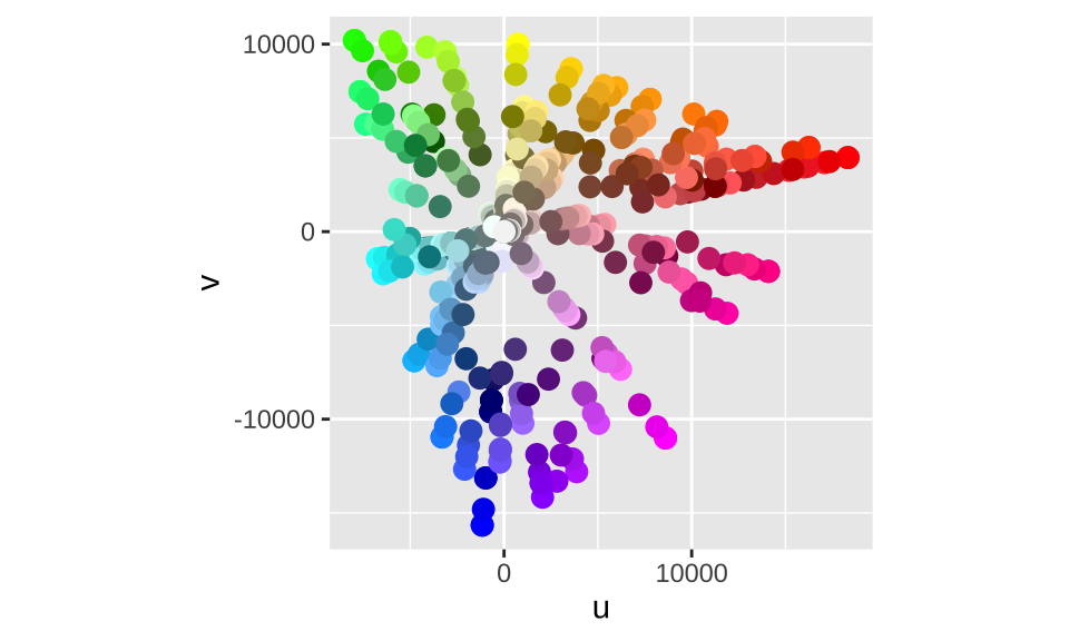
4.5 Identity scales
Identity scales, such as scale_color_identity() and scale_shape_identity(), are used when your data is already scaled such that the data and aesthetic spaces are the same.
ggplot(luv_colours, aes(u, v)) +
geom_point(aes(color = col), size = 3) +
scale_color_identity() +
coord_equal()