1 Introduction
In general, there are three purposes for a layer:
- To display the data.
- To display a statistical summary of the data.
- To add additional metadata: context, annotations, and references.
2 Geoms
Geoms can be roughly divided into individual and collective geoms.
- Individual geoms draw a distinct graphical object for each observation (row). For example, the point geom draws one point per row.
geom_bar(stat = "identity")makes a bar chart. We need stat = “identity” because the default stat automatically counts valuesgeom_area()draws an area plot, which is a line plot filled to the y-axis (filled lines).geom_rect()draw rectangles (parameterised by the four corners of the rectangle).geom_tile()also draw rectangles (parameterised by the center of the rect and its size).geom_raster()is a fast special case ofgeom_tile()used when all the tiles are the same size.
- Collective geoms display multiple observations with one geometric object.
- The assignment of observations to graphical elements can be controlled by
groupaesthetic (shown below). - If a group is defined by a combination of multiple variables, use
interaction()to combine them, e.g.aes(group = interaction(school_id, student_id)). - Setting the grouping aesthetic in
ggplot()will affect all geoms below. - Lines and paths operate on a “first value” principle: each segment is defined by two observations, and ggplot2 applies the aesthetic value (e.g., color) associated with the first observation when drawing the segment.
- Mapping aesthetics to discrete variables works well for bar and area plots, resulting in stacking individual pieces.
- The assignment of observations to graphical elements can be controlled by
library(babynames)
hadley <- dplyr::filter(babynames, name == "Hadley")
ggplot(hadley, aes(year, n, group = sex, color = sex)) +
  geom_line()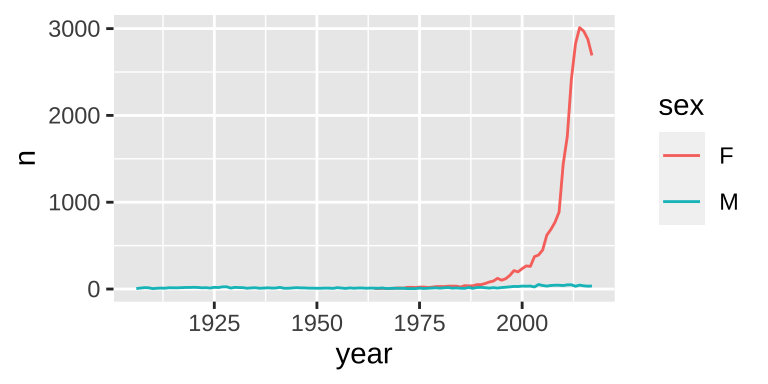
3 Statistical summaries
3.1 Revealing uncertainty
There are four basic families of geoms using the aesthetics ymin and ymax to show uncertainty:
- Discrete x, range:
geom_errorbar(),geom_linerange() - Discrete x, range & center:
geom_crossbar(),geom_pointrange() - Continuous x, range:
geom_ribbon() - Continuous x, range & center:
geom_smooth(stat = "identity")
y <- c(18, 11, 16)
df <- data.frame(x = 1:3, y = y, se = c(1.2, 0.5, 1.0))
base <- ggplot(df, aes(x, y,
                       ymin = y - se, ymax = y + se))
base + geom_crossbar()|
base + geom_pointrange()|
base + geom_smooth(stat = "identity")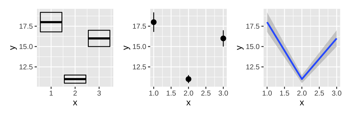
base + geom_errorbar()|
# if set width of errorbar to 0, it will be same as linerange
base + geom_errorbar(width = 0)|
base + geom_linerange()|
base + geom_ribbon()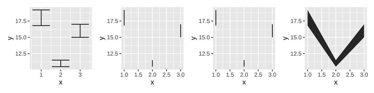
3.2 Weighted data
Data can be weighted by the weight aesthetic.
# Unweighted
ggplot(midwest, aes(percwhite, percbelowpoverty)) +
  geom_point() +
  geom_smooth(method = lm, size = 1) |

# Weighted by population
ggplot(midwest, aes(percwhite, percbelowpoverty)) +
  geom_point(aes(size = poptotal / 1e6)) +
  geom_smooth(aes(weight = poptotal),
              method = lm, size = 1) +
  scale_size_area(guide = "none")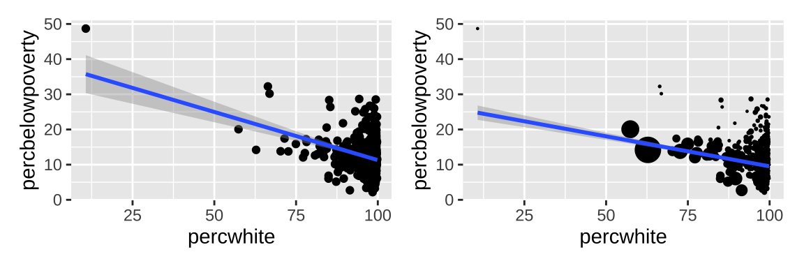
3.3 Displaying distributions
There are a number of geoms that can be used to display distributions. To compare the distribution between groups, you have a few options:
- Show small multiples of the histogram,
facet_wrap(~ var). - Use color and a frequency polygon,
geom_freqpoly(). - Use a “conditional density plot”,
geom_histogram(position = "fill").
An alternative to a bin-based visualisation is a density estimate. geom_density() places a little normal distribution at each data point and sums up all the curves.
# define layout
layout <- "
AB
CD
EF
"
# Use color and a frequency polygon
ggplot(diamonds, aes(depth)) +
  geom_freqpoly(aes(color = cut),
                binwidth = 0.1, na.rm = TRUE) +
  theme(legend.position = "none") +
# Use a "conditional density plot"
ggplot(diamonds, aes(depth)) +
  geom_histogram(aes(fill = cut),
                 binwidth = 0.1, position = "fill",
                 na.rm = TRUE) +
  theme(legend.position = "none") +
# density plot
ggplot(diamonds, aes(depth)) +
  geom_density(na.rm = TRUE) +
  theme(legend.position = "none") +
# adjust binwidth
ggplot(diamonds, aes(depth)) +
  geom_histogram(aes(fill = cut),
                 binwidth = 0.2, position = "fill",
                 na.rm = TRUE) +
  theme(legend.position = "none") +
# adjust = 1/2 means use half of the default bandwidth (more rough)
ggplot(diamonds, aes(depth)) +
  geom_density(na.rm = TRUE, adjust = 0.5) +
  theme(legend.position = "none") +
# both fill and color can separate groups
ggplot(diamonds, aes(depth, fill = cut)) +
  geom_density(alpha = 0.2, na.rm = TRUE) +
  theme(legend.position = "none") +
# apply layout and set common x axis
plot_layout(design = layout) &
  scale_x_continuous(limits = c(58, 68))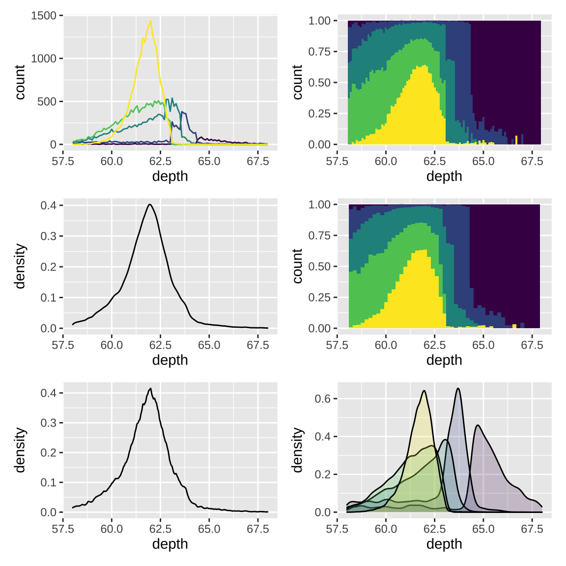
3.4 Dealing with overplotting
When the data is large, points on a scatterplot will overlap. This problem is called overplotting, which can be solved by a number of ways:
- Making points smaller (
geom_point(shape = ".")) or using hollow glyphs (geom_point(shape = 1)). - Making points transparent (
geom_point(alpha = 1 / 10)). - Alleviate some overlaps with
geom_jitter(), and adjust points bywidthandheightarguments. - Breaking the plot into many small squares or hexagons.
df <- data.frame(x = rnorm(2000),
                 y = rnorm(2000))
norm <- ggplot(df, aes(x, y)) +
  xlab(NULL) + ylab(NULL)
norm + geom_bin2d() |
# adjust bins
norm + geom_hex(bins = 10)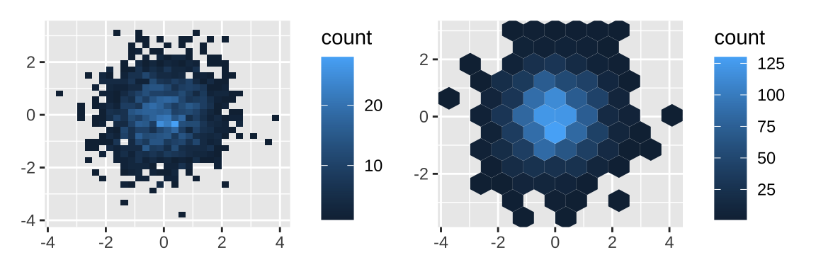
- Adding data summaries to help guide the eye to the true shape of the pattern within the data
3.5 Statistical summaries
Some summary functions like stat_summary() can produce y, ymin and ymax aesthetics.
# show number of observations in each bin
ggplot(diamonds, aes(color)) +
  geom_bar() |
# show average price
ggplot(diamonds, aes(color, price)) +
  geom_bar(stat = "summary_bin", fun = mean) +
  coord_cartesian(ylim=c(2000,6000)) |
# show average price with se
ggplot(diamonds, aes(color, price)) +
  stat_summary(fun = mean, geom = "bar") +
  stat_summary(fun.data = mean_se,
               geom = "errorbar",width = 0.1) +
coord_cartesian(ylim=c(2000,6000)) 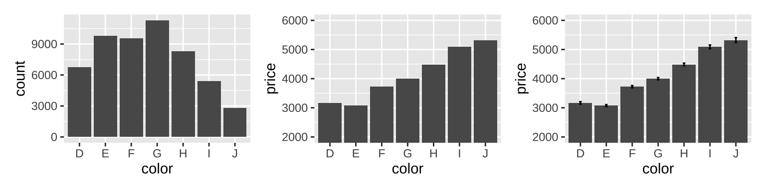
3.6 Surfaces
The ggplot2 package does not support true 3d surfaces, but it does support many common tools for summarizing 3d surfaces in 2d.
small <- faithfuld[seq(1, nrow(faithfuld), by = 10), ]
# contour
# the .. notation (..level..)
# refers to a variable computed internally
ggplot(faithfuld, aes(eruptions, waiting)) +
  geom_contour(aes(z = density, color = ..level..)) |
# raster
ggplot(faithfuld, aes(eruptions, waiting)) +
  geom_raster(aes(fill = density)) |
# Bubble plots work better with fewer observations
ggplot(small, aes(eruptions, waiting)) +
  geom_point(aes(size = density), alpha = 1/3) +
  scale_size_area()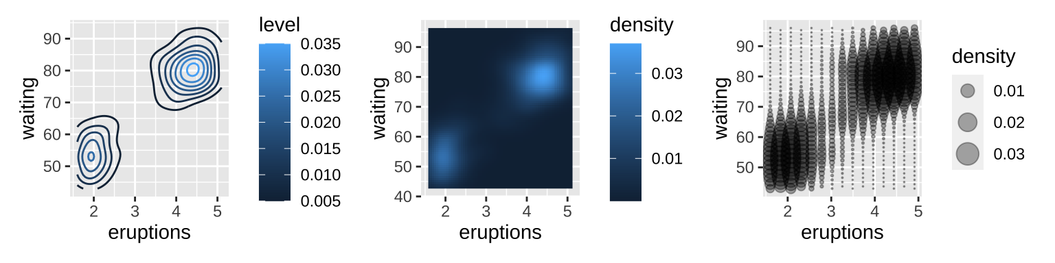
There is another good example for geom_tile() in this website: Top 50 ggplot2 Visualizations.
var <- mpg$class  # the categorical data
## Prep data (nothing to change here)
nrows <- 10
df <- expand.grid(y = 1:nrows, x = 1:nrows)
categ_table <- round(table(var) * ((nrows*nrows)/(length(var))))

df$category <- factor(rep(names(categ_table), categ_table))
# NOTE: if sum(categ_table) is not 100 (i.e. nrows^2),
# it will need adjustment to make the sum to 100.

## Plot
ggplot(df, aes(x = x, y = y, fill = category)) +
  # set border color and size
  geom_tile(color = "black", size = 0.5) +
  scale_x_continuous(expand = c(0, 0)) +
  scale_y_continuous(expand = c(0, 0), trans = 'reverse') +
  scale_fill_brewer(palette = "Set3") +
  labs(title="Waffle Chart", subtitle="'Class' of vehicles",
       caption="Source: mpg") +
  theme(panel.border = element_rect(size = 1, fill = NA),
        plot.title = element_text(size = rel(1.2)),
        axis.text = element_blank(),
        axis.title = element_blank(),
        axis.ticks = element_blank(),
        axis.line=element_blank(),
        legend.title = element_blank(),
        legend.position = "right")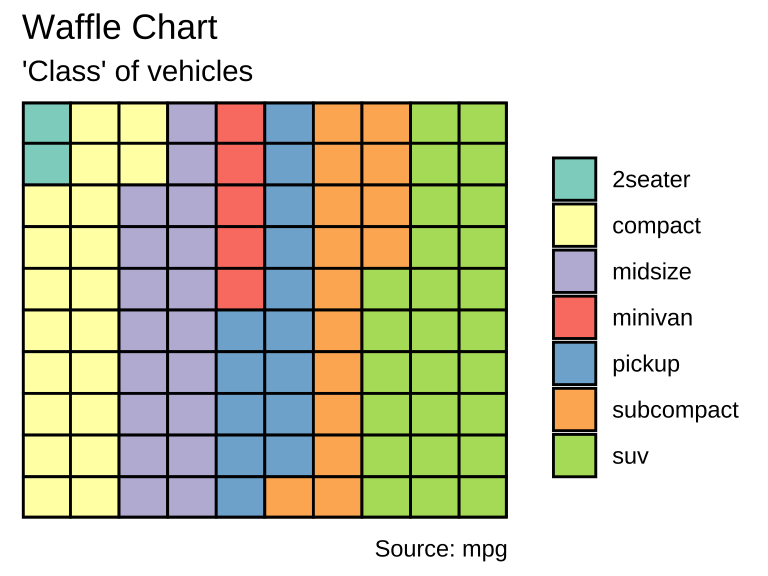
4 Annotations
Conceptually, an annotation supplies metadata for the plot: that is, it provides additional information about the data being displayed.
4.1 Plot and axis titles
The labs() helper function lets you to set the various titles using name-value pairs like title = "My plot title". Mathematical expressions wrapped in quote(). The rules by which these expressions are interpreted can be found by typing ?plotmath. To enable markdown you need to set the relevant theme element to ggtext::element_markdown().
base <- ggplot() + xlim(-2*pi, 2*pi)
base +
  geom_function(fun = rlang::as_function(~ sin(.x^3)))+
  labs(x = "Axis title with *italics* and **boldface**",
       y = quote( f(x) == sin(x^3) ))+
  theme(axis.title.x = ggtext::element_markdown())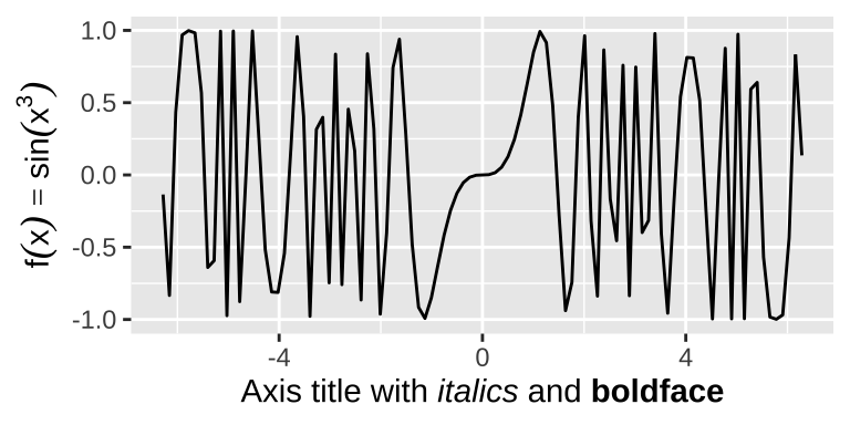
There are two ways to remove the axis label. Setting labs(x = "") omits the label but still allocates space; setting labs(x = NULL) removes the label and its space.
4.2 Text labels
The function geom_text() adds label text at the specified x and y positions. It has the most aesthetics of any geom, because there are so many ways to control the appearance of a text:
familyaesthetic provides the name of a font.fontfaceaesthetic specifies the face, which can be “plain” (the default), “bold” or “italic”.hjust(“left”, “center”, “right”, “inward”, “outward”) andvjust(“bottom”, “middle”, “top”, “inward”, “outward”) aesthetics controls alignment of the text.sizeaesthetic specifies the font size in millimeters (There are 72.27 pts in a inch, so to convert from points to mm, just multiply by 72.27 / 25.4).anglecontrols the rotation of the text in degrees.
In addition to the various aesthetics, geom_text() has three parameters:
nudge_xandnudge_yare useful to offset the text label.- If
check_overlap = TRUE, overlapping labels will be automatically removed from the plot.
Another function geom_label() draws a rounded rectangle behind the text.
4.3 Building custom annotations
One useful way to annotate this plot is to use shading to indicate which president was in power at the time. The annotate() helper function which creates the data frame.
presidential <- subset(presidential,
                       start > economics$date[1])
yrng <- range(economics$unemploy)
xrng <- range(economics$date)
caption <- paste(
  strwrap("Unemployment rates in the US have
  varied a lot over the years", 40),
  collapse = "\n")

ggplot(economics) +
  # use geom_rect() to introduce shading
  geom_rect(
    aes(xmin = start, xmax = end, fill = party),
    ymin = -Inf, ymax = Inf, alpha = 0.2,
    data = presidential
  ) +
  # use geom_vline() to introduce separators
  geom_vline(
    aes(xintercept = as.numeric(start)),
    data = presidential,
    color = "grey50", alpha = 0.5
  ) +
  # use geom_text to add labels
  geom_text(
    aes(x = start, y = 2500, label = name),
    data = presidential,
    size = 3, vjust = 0, hjust = 0, nudge_x = 50
  ) +
  # use geom_line() to overlay the data on top of
  # these background elements
  geom_line(aes(date, unemploy)) +
  scale_fill_manual(values = c("blue", "red")) +
  annotate(geom = "text",
           x = xrng[1], y = yrng[2],
           label = caption,
           hjust = 0, vjust = 1, size = 4)+
  # change legend position
  theme(legend.position = "bottom")+
  xlab("date") +
  ylab("unemployment")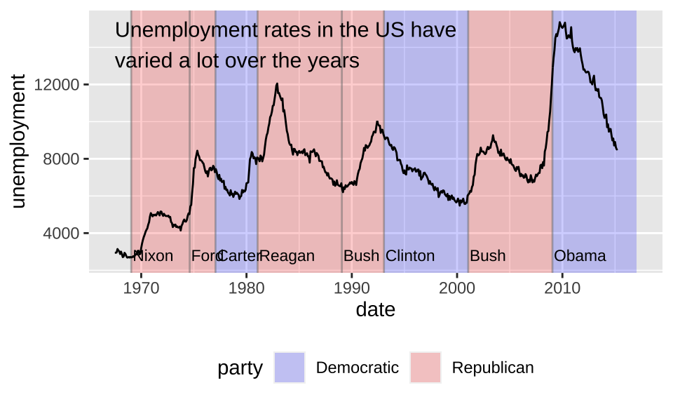
Highlight a subset of points can be achieved by drawing larger points in a different color underneath the main data set. geom_curve() and geom_segment() can be used to draw curves and lines connecting points with labels.
p <- ggplot(mpg, aes(displ, hwy)) +
  geom_point(
    data = filter(mpg, manufacturer == "subaru"),
    color = "orange",
    size = 3) +
  geom_point()

p + annotate(
  geom = "curve", x = 4, y = 35, xend = 2.65, yend = 27,
  curvature = .3, arrow = arrow(length = unit(2, "mm"))) +
  annotate(geom = "text", x = 4.1, y = 35, label = "subaru",
           hjust = "left")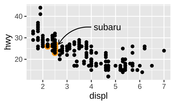
5 Arranging plots
As shown before, the patchwork package can arrange plots flexibly.
+does not specify any specific layout, only that the plots should be displayed together.- layout can be controlled by
plot_layout(), likeplot_layout(ncol = 2). - operators
/and|can facilitate generating columns and rows. - operators can be grouped by parentheses (e.g.
p3 | (p2 / (p1 | p4))). - complex layouts can be specified in the
designargument inplot_layout(). - guides can be combined and shown in a particular region (e.g.
p1 + p2 + p3 + guide_area() + plot_layout(ncol = 2, guides = "collect")). &can change theme and axis for all the graphics.- tags can be nested by setting
tag_levelinplot_layout().
p123[[2]] <- p123[[2]] + plot_layout(tag_level = "new")
p123 + plot_annotation(tag_levels = c("I", "a"))- plots can be shown on top of each other using
inset_element().
p24 <- p2 / p4 + plot_layout(guides = "collect")
p1 +
  inset_element(
    p24,
    left = 0.4,
    bottom = 0.4,
    right = unit(1, "npc") - unit(15, "mm"),
    top = unit(1, "npc") - unit(15, "mm"),
    align_to = "full"
  )